Typography Guidelines
Typography
The selection of typography plays an important role in reinforcing our brand in all communications. The approved fonts are confident and simple, reflecting Cal Poly Pomona's contemporary nature.
Primary Font
It is the responsibility of each department to add these fonts to their devices. Please contact IT if you require assistance.
All styles of Helvetica: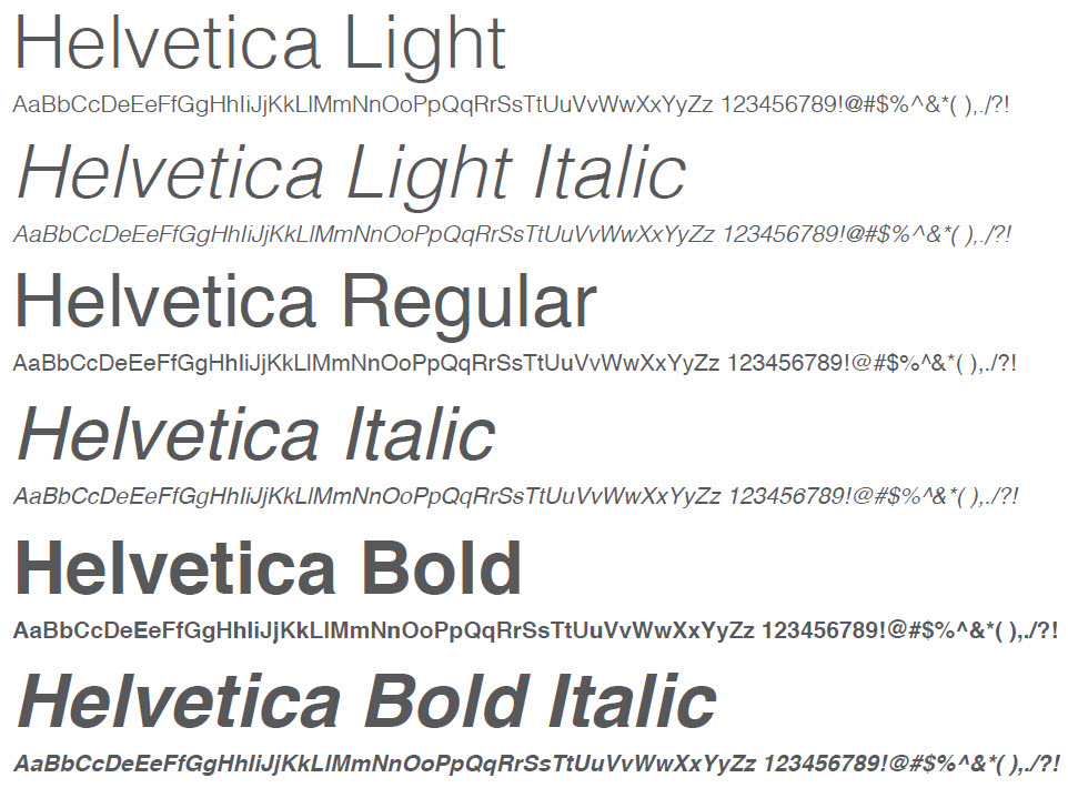
- Helvetica Light
- Helvetica Light Oblique
- Helvetica Regular
- Helvetica Oblique
- Helvetica Bold
- Helvetica Bold Oblique
- Justus Pro Regular
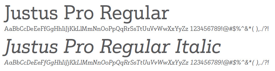
- Justus Pro Regular Italic
Just
Justus is available through TypeKit. https://typekit.com/fonts/justus
Alternative Fonts
While Helvetica and Justus Pro is the primary and preferred typeface for Cal Poly Pomona, Arial and Rockwell are acceptable substitute when the primary font is not available.
- Rockwell Light
- Rockwell Light Italic
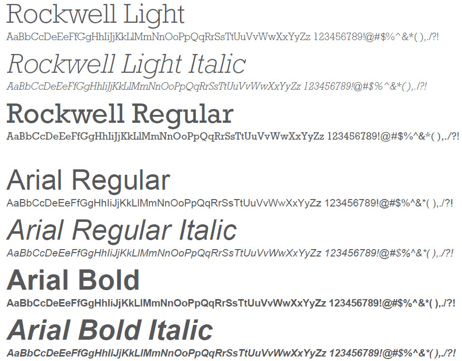
- Rockwell Regular
- Arial Regular
- Arial Regular Italic
- Arial Bold
- Arial Bold Italic
Type in Use
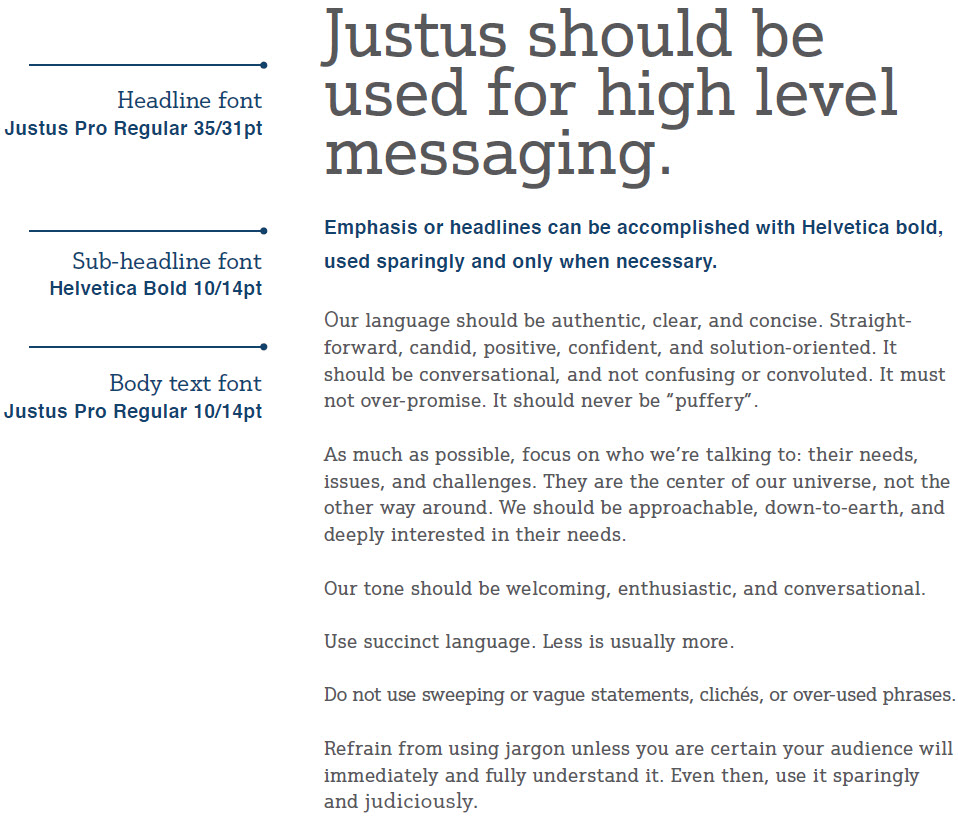
Our typographic language can be accomplished by simply using smart choices when it comes to hierarchy and applying emphasis.Think of Justus primarily as a display font (voice font), used large and for communicating the core message.
Helvetica will support the typographic language by primarily communicating longer lead-ins of information.
And back to Justus again for the reader friendly text.