University Logo
Primary Logo
Primary Logo Horizontal Stacked
Primary Logo Vertical Stacked
Primary Logo Inside Stacked
Horizontal Logo BW
Horizontal Stacked Black
Horizontal Stacked White
Vertical Stacked BW
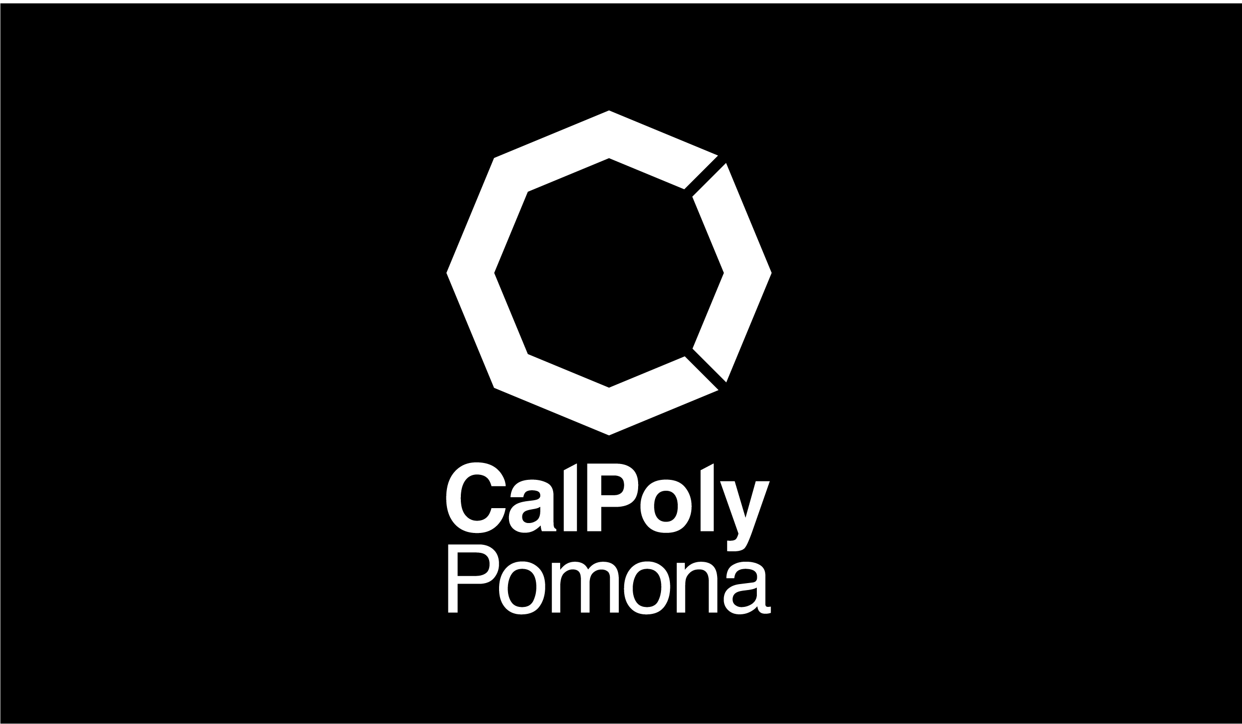
Vertical Stacked White
Download Vertical Stacked White (.zip)
Horizontal White
Wordmark
Wordmark Stacked
Wordmark BW
Wordmark BW Stacked
Wordmark Horizontal White
Download Wordmark Horizontal White (.zip)
Wordmark Stacked White
Download Wordmark Stacked White (.zip)The Logo Explained
![]() The current CPP logo, introduced in 2018, conveys that CPP is a campus on the move, constantly seeking to improve and progress. The wordmark Cal Poly Pomona is intrinsic to the logo and underscores the university's deep connection with its namesake city. The traditional green and gold are found in the octagon's arrow, to further distinguish the university. The octagon shape reflects the eight academic colleges and the eight elements of an inclusive polytechnic education, which are described in the university’s Academic Master Plan.
The current CPP logo, introduced in 2018, conveys that CPP is a campus on the move, constantly seeking to improve and progress. The wordmark Cal Poly Pomona is intrinsic to the logo and underscores the university's deep connection with its namesake city. The traditional green and gold are found in the octagon's arrow, to further distinguish the university. The octagon shape reflects the eight academic colleges and the eight elements of an inclusive polytechnic education, which are described in the university’s Academic Master Plan.
- The application of knowledge
- Creativity, discovery and innovation
- Critical thinking and problem-solving
- Diverse and multidisciplinary perspectives
- Integration of technology
- Collaborative learning
- Community and global engagement
- Professional and career readiness
The multiple facets of the octagon symbolize the interdependent nature of a Cal Poly Pomona education inside and outside the classroom.