Color Guidelines
Color
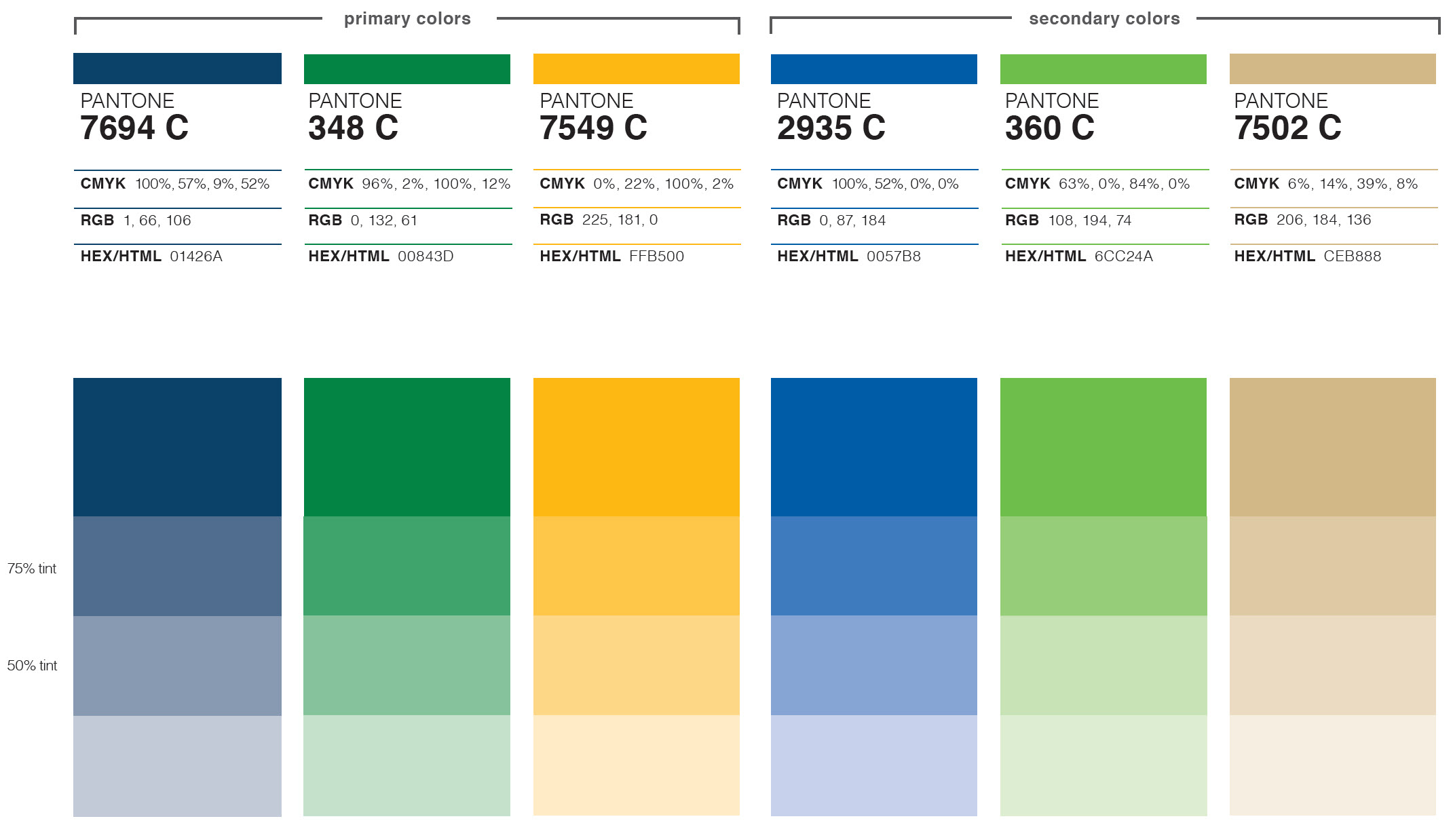
Color is a vital aspect of the Cal Poly Pomona visual vocabulary. It connotes power, evokes emotion and establishes overall brand uniformity. The Cal Poly Pomona color palette consists of a primary color and secondary or accent colors.
Pallette
Ratio of Use
Primary Blue, Green and Gold/Yellow are meant to be used more than any other colors in the palette. The secondary colors are meant to act as complements to the main color palette.
Color Equivalents
CPP family of colors should be used consistently in all communications. The visual appearance of these colors may vary slightly when used in different media, materials and surfaces, however an effort should be made to color match as closely as possible through a proofing process. We have provided basic color formulas as a guide. Please choose the color formula that best suit the media. When printing, please match to PANTONE® colors, match to (C) swatches.