Logo Guidelines
Primary Logo
Our identity consists of both and icon (the octagon) and wordmark (Cal Poly Pomona) which must always appear together in the exact colors and proportions illustrated.
 The Primary Logo is the most commonly used version in Cal Poly Pomona communication materials. The type should never appear in any other way – with different typefaces or disproportionately distorted dimensions.
The logo is the cornerstone of the visual identity system. It must appear at least once on every piece of communication and should comply to the standards in this guideline.
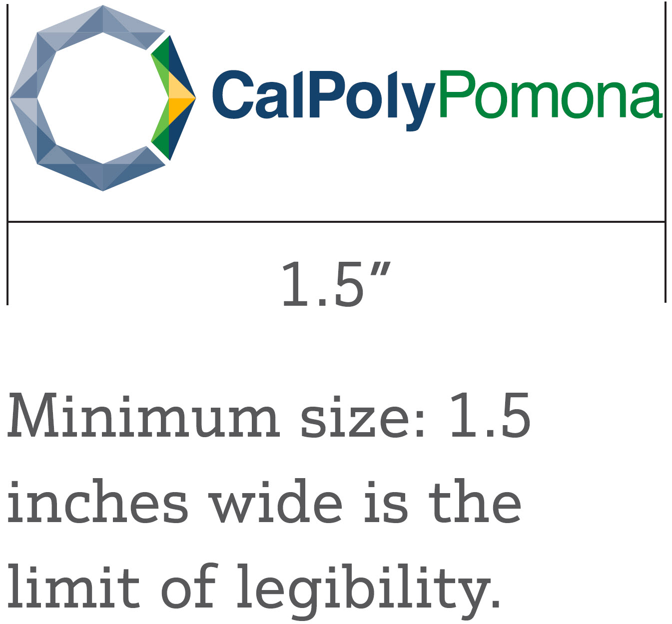
*Minimum size: 1.5 inches wide is the limit of legibility
Primary Logo Horizontal Stacked and Primary Logo Vertical Stacked
Alternative designs are supplied and can be used when space necessitates their usage.
*Primary logo horizontal stacked minimum size: 1.25 inches wide is the limit of legibility
*Primary logo vertical stacked minimum size: 0.5 inches wide is the limit of legibility
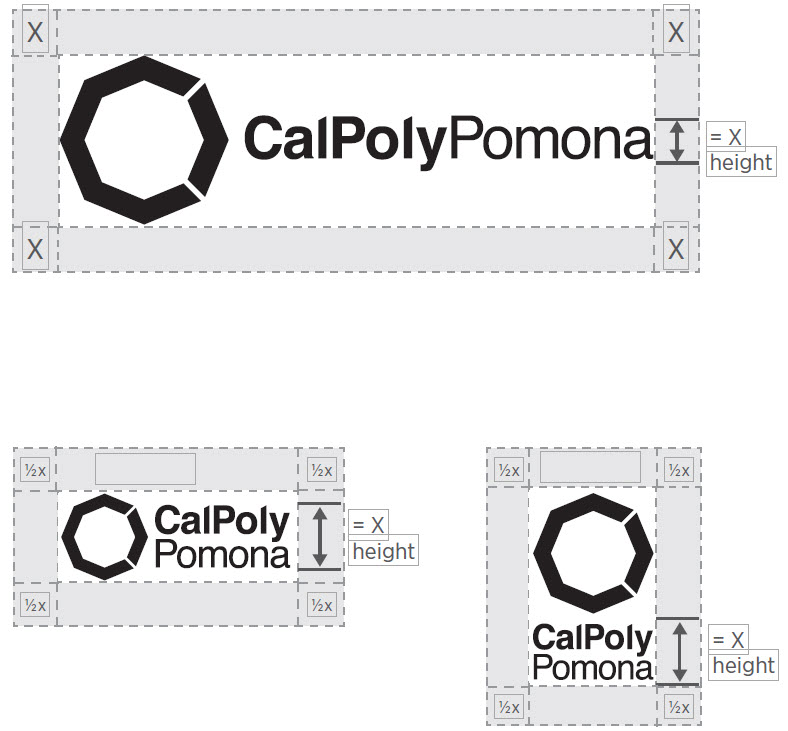
Clear Space
Minimum Size
The CPP logo should not be used in applications smaller than .45 inches or 20 pixels tall. The only allowable exception to this is when there is not space to meet this standard.
Wordmark
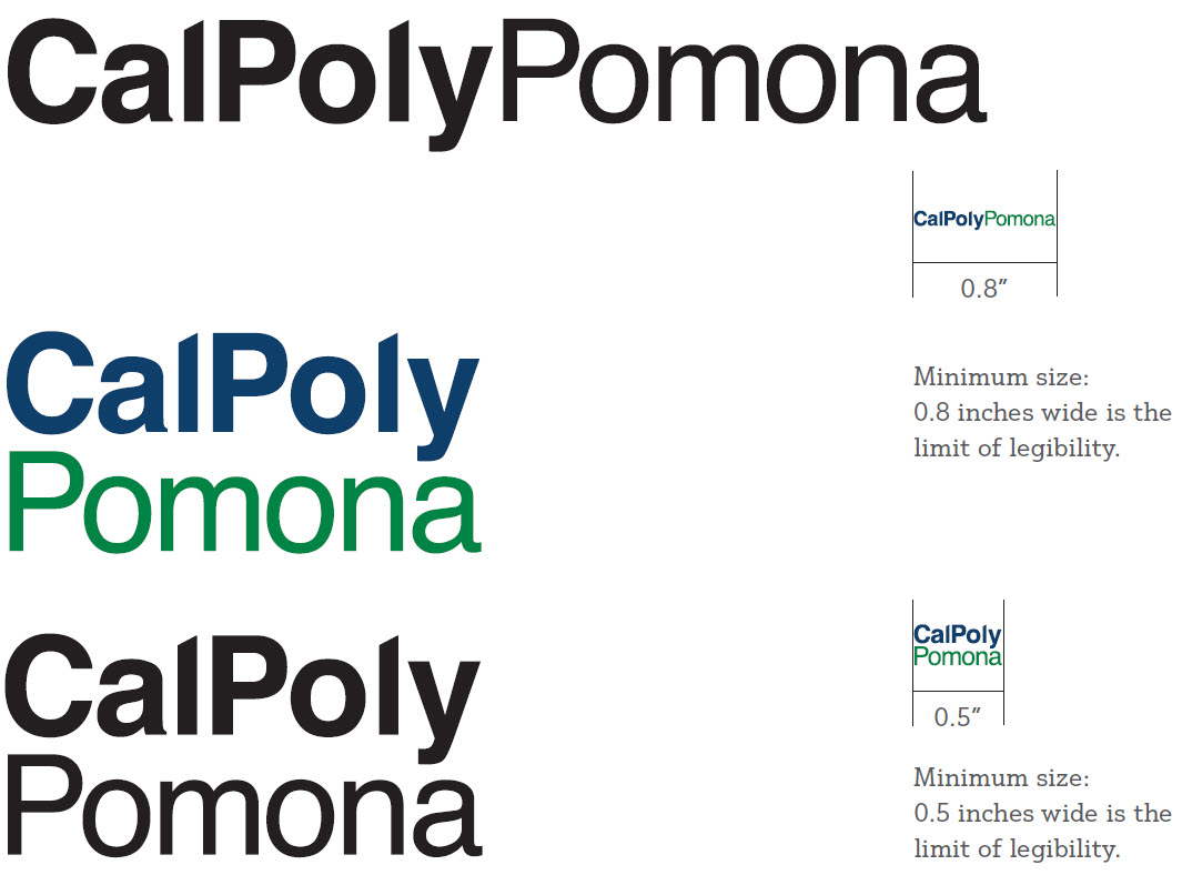
Wordmark Variations
This configuration is the preferred way of displaying our name.
This configuration should only be used when horizontal space is limited and the one-line variation is not legible. This should be used in limited situations.
Variations
Logo Variations
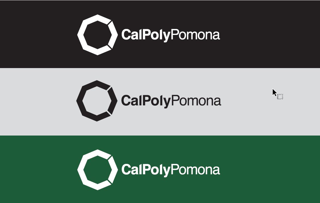
To add depth, variety, innovation, and fun to the Cal Poly Pomona identity, there are multiple variations of the logo.
On Backgrounds

Over Photography


