Cards Module Tutorial
Instructions
In Cascade, you can choose between two card styles: text only or image and text. Expand the accordions below to explore each option in detail.
Page View
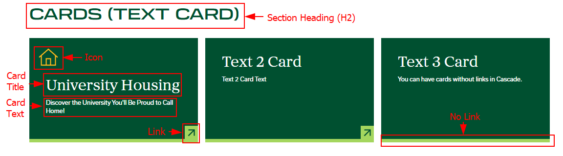
For this section you will need:
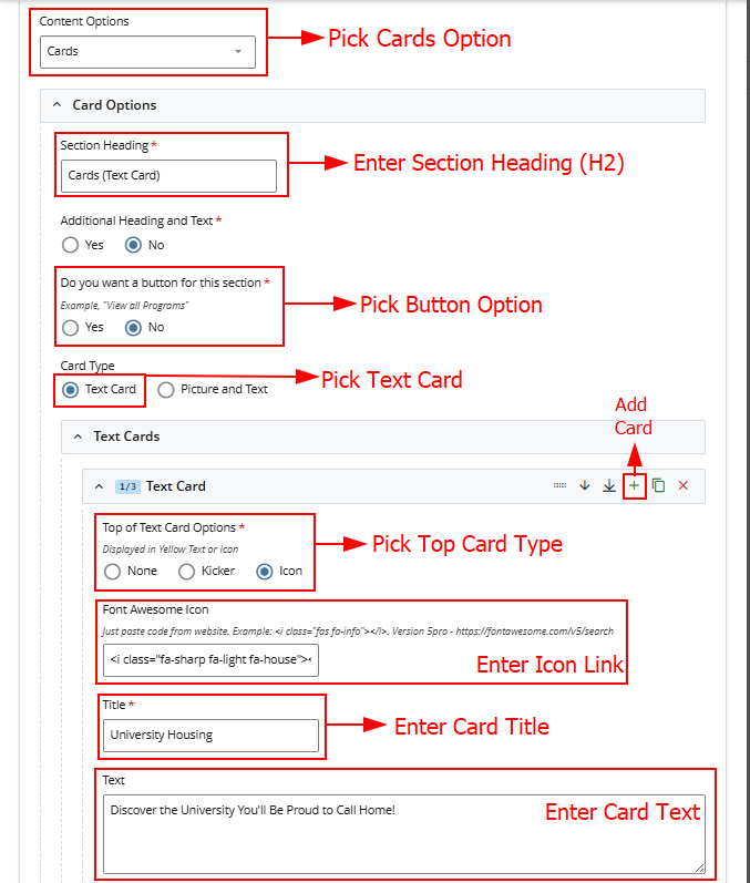
- Heading (H2)
- Card Title + Text
- Card Link (Optional)
- Icon Code (Optional) -- See Icon Tutorial Here
Cascade View
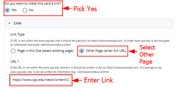
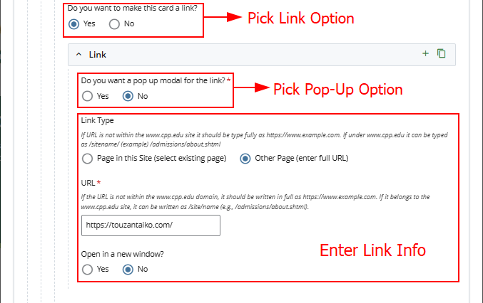
Link Option 1
Link Option 2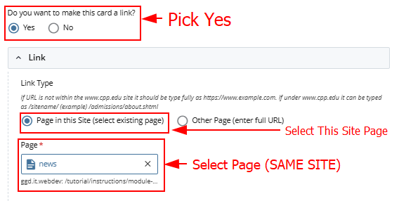
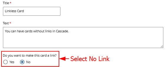
No Link
Page View
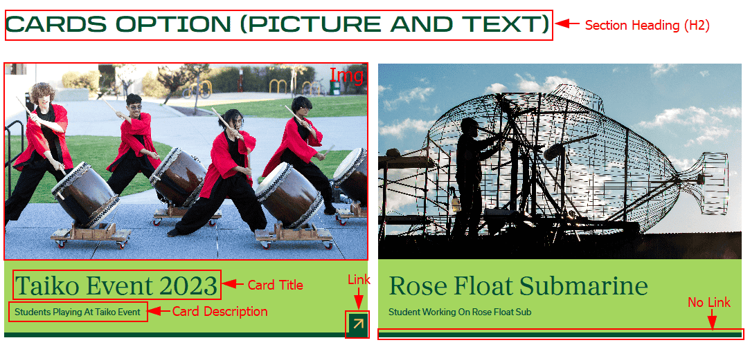
For this section you will need:
- Heading (H2)
- Card Title + Description + Image
- Card Link (Optional)
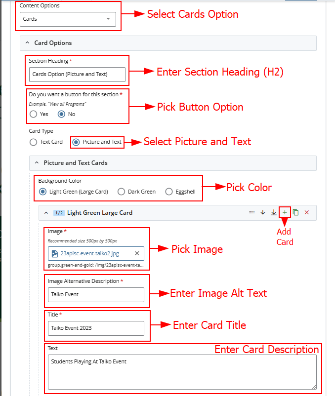
Cascade View
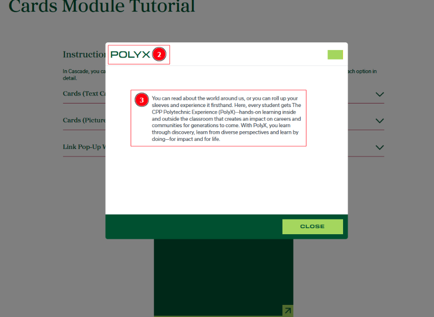
In Cascade, you can create a pop-up window on cards.
For this option, you will need
- Title
- Content
Cascade View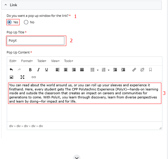
Page View