Color Contrast
What is color contrast?
You can use color to make your web pages visually appealing, attract users, and convey information. Although color is a useful tool for presenting content and information, improper use of color can also create accessibility barriers. When using color, it is important to have sufficient contrast between the foreground color and background color.
Did you know?
What most people refer to as color contrast in accessibility is actually the difference in luminance (brightness) between the two colors, so the hues themselves do not matter at all!
Color Contrast in ...
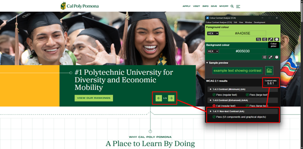
Having low color contrast makes it difficult for sighted users to read and understand the content on your page. You can easily test the color contrast on your page using the WebAIM Contrast Checker. WCAG color contrast guidelines state that there should be a ratio of at least 4.5:1 between foreground content and background content. However, this guideline does have some specific exceptions:
- Large Content
- If the text is large enough to exceed 18pt font or 14pt bold font, the minimum contrast ratio requirement is lowered to 3:1.
- Decorative Content
- If the content is decorative, there is no minimum contrast ratio requirement.
- Logos and Wordmarks
- If the content is part of a logo or wordmark, there is no minimum contrast ratio requirement.
Users with color vision impairments or low visibility may find it difficult to view content with a low color contrast ratio. Good color contrast increases the content's readability and ensures that users have a positive experience when viewing the page.
Below are examples of good versus bad color contrast ratios: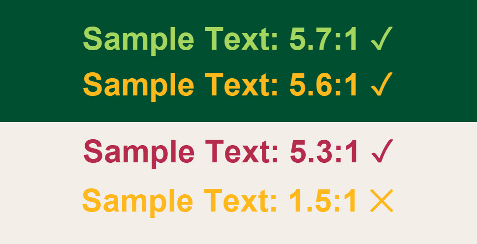
Simulated Color Loss: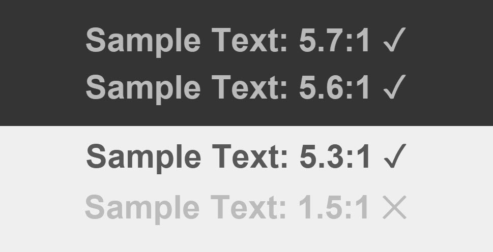
Note: The ratios are no longer accurate due to the simulation process.
Generally, text in images must also meet minimum contrast ratio requirements. However, there are some exceptions.
- Text that is meant to be decorative (e.g., a word cloud on the cover of a dictionary).

- Text in an image that contains more important information (e.g., the words on a street sign in a photo of a large city).

- Text in logos or wordmarks (e.g., the words Cal Poly Pomona in the CPP logo).

One specific form of text that must meet additional contrast requirements are links that do not have any other form of visual identifier (e.g. underline) to separate them from regular text. These links must meet the following criteria in addition to standard contrast rules for text:
- The link text must have a 3:1 contrast with the surrounding text AND
- A visual indicator on hover/focus (e.g. underline) that differentiates it from the surrounding text.
However, the easiest way to make links accessible is to leave the default underline that separates them from normal text.
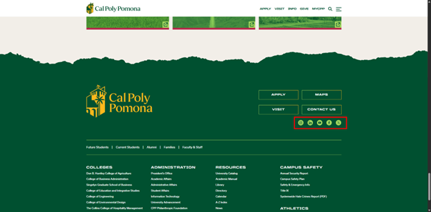
While color contrast is most often thought of in relation to text, there are other components of a webpage that have contrast requirements. User interface components, such as buttons and checkboxes must have a contrast ratio of 3:1 against all adjacent colors. This includes those used within the component itself! The example below shows a set of buttons on the CPP home page that meets this requirement.
Note: All states of an interface component must have a contrast ratio of 3:1, including when hovered or focused.
The other type of non-text component that must meet a 3:1 contrast ratio are graphics that are necessary for users to understand the content. For example, a social media icon that is used as a link would need to meet this ratio (unless there is also real text that indicates the link’s purpose and meets contrast requirements within the link).