Images
What is an alternative text?
Alternative text, or alt text, is the textual representation of an image or figure that is most often presented to assistive technology users. This can include:
- The words in the image
- A description of what the image depicts
- The image’s function
- And much more!
Providing alt text on important images gives all your users equal access to the information on your sites.
The Rules of Alternative Text
While it may be tempting to give all of your images alt text descriptions, misused alt text can be a hindrance to assistive technology users, rather than a benefit. For example, do the decorative graphics in the image below require alt text?
If you said no, then you are right!
While these elements may contribute to the aesthetic of the page, they do not provide meaningful information that needs to be conveyed to assistive technology users. Then, when do we need to provide alt text? Use the examples below to guide you. We have also provided a quick cheat sheet to writing good alt text!
For more examples, visit the W3C WAI Images Tutorial.
Confused about whether your image needs alt text? You can use this abbreviated version of the W3C WAI alt Decision Tree as a quick reference for all your alt text needs.
DO include alt text when:
- The image contains text
- AND the text is not present as real text nearby
- AND the text is not just for visual effects
- OR the image indicates a button’s function
- AND that function is not understood without the image
- OR the image contributes meaning in context
- AND it is not a graph or complex image (which should be explained in real text nearby)
- AND its content is not redundant to real text nearby.
Figuring out the balance between being too descriptive and not descriptive enough can be challenging for web developers. Here are some general tips that can help you write good alt text:
- DO keep it concise. A short (grammatically correct) sentence fragment is better than 3 long sentences. Generally, keep your alt text to 2 sentences or shorter.
- DO describe an image link’s destination, rather than its contents.
- DO describe the main content/text in the image (if it is not a link or complex image).
- DO use proper spelling, grammar, and punctuation. Write your alt text just as you would write visible text on your page!
- DO mark images as decorative if they could be removed without changing a user’s understanding of the page.
- DO NOT use the phrases “Image of” or “Picture of”. Screen readers announce when they enter an image, so these phrases do not provide any useful information.
- DO NOT repeat text that is found nearby. If you would use real text nearby as the alt text for an image, it is better to mark the image as decorative.
For more help, check out the W3C WAI Image Guide Tips and Tricks.
Types of Images
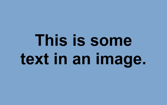
alt = “Text: This is some text in an image.”
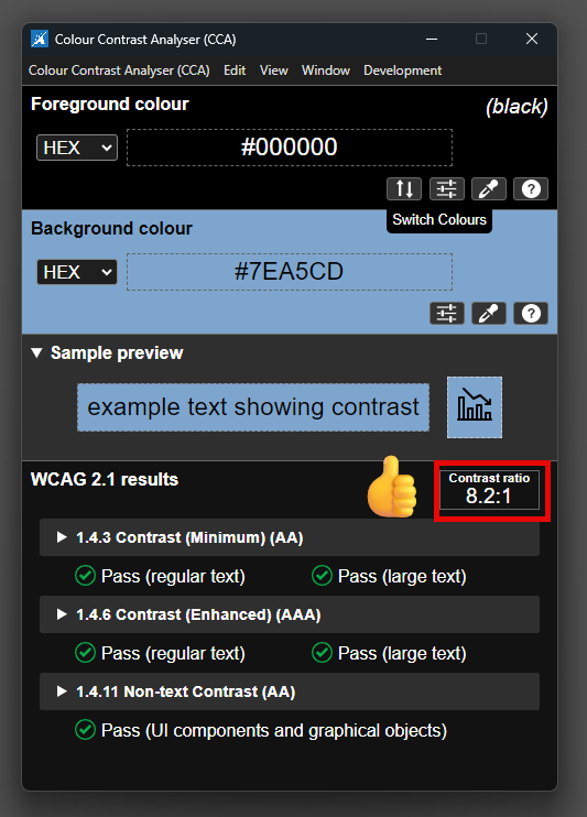
While it is usually best practice to avoid using images of text (rather than real text), sometimes it is unavoidable. In these cases, if the text is important to the viewer’s understanding of the image, it must meet the color contrast requirements used for real text.
- If your text is large (18 pt font size or larger, or 14 pt bold or larger) it must have a minimum 3:1 contrast ratio with its background.
- Otherwise, it must have a minimum 4.5:1 contrast ratio with its background.
alt = “”
Assuming that the text is real text on a page (not an image), this marks the image (any one of the circles) as decorative and tells assistive technology to skip over the image. This way an assistive technology user can get to the content of the page quicker, instead of having to listen to “graphic blue circle graphic small green circle …”.
Images with an adjacent text alternative can also be marked as decorative, as they provide no further information to the user. In Cascade, this can be done by clicking on the checkbox labeled “Decorative”. 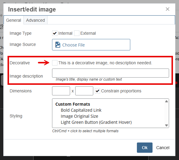
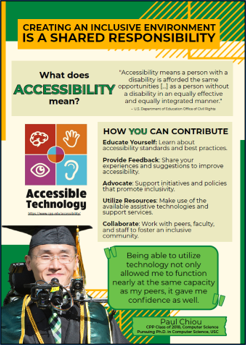
alt = “Accessible Technology flyer, information presented below”
For complex images such as flyers and graphs it is better to present the information in an alternate format than to have paragraphs of alt text. In these cases, alt text can be used to direct an assistive technology user to another location on the page with the information in an accessible format. For this example, we would type the flyer’s content as real text below the image. Graphs and charts can be presented as properly formatted tables to ensure all users are able to access the data.
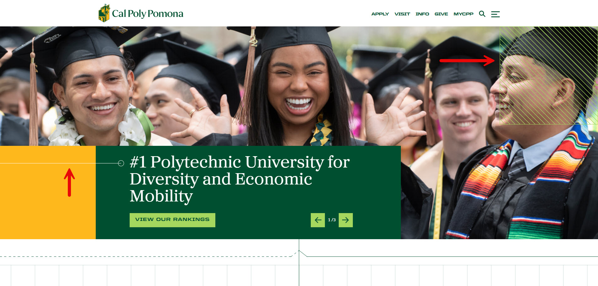
Images that act as links should have alt text that indicates the link's purpose, rather than describing the image itself. In these cases, alerting assistive technology users of the link is more important than the content of the image. While this image could have an alt text of “Aerial photo of CPP”, its function as a link to the CPP home page takes precedence.
