Accessible Tab Order
Why is Tab Order Important?
While many users are accustomed to using a mouse for site navigation, it is important to consider those who rely on a keyboard as their main way of interacting with digital content.
Tab order refers to the sequence in which focusable elements, such as links, buttons, and form fields, are selected when a user moves through a digital interface using the Tab key on their keyboard. These elements need to receive focus in order that preserves meaning and operability, so users can understand the page and use its features easily.
This seemingly small detail plays a critical role in ensuring digital materials are accessible, navigable, and usable for everyone. This is particularly important for users who rely on keyboard navigation instead of a mouse, which include:
- People with motor impairments who rely on keyboard access for operating a page
- Blind or low-vision users using screen readers
- Users with temporary impairments
If tab order is not properly implemented:
- People with disabilities that make reading difficult or visual impairments can become disoriented. Jumping around the page makes it hard to understand content relationships or perform actions
- Important elements may be missed. If an interactive element is not reachable by keyboard, it is essentially unusable to someone who can't use a mouse
- Only a small portion of the page may be visible to an individual using a screen magnifier at a high level of magnification
Good tab order:
- Follows a logical, intuitive flow. Typically top to bottom, left to right, like how content is visually laid out
- Matches the visual layout so users can predict where the next focus will go
- Prioritizes interactive elements in the order they're meant to be read
- Avoids "focus traps", which happen when a user gets stuck on a page element and can't navigate to another element using a keyboard
Implementing Accessible Tab Order
The tabindex attribute in HTML determines the focus order of elements when navigating with the Tab key. It allows developers to specify which elements receive focus and the order in which they receive focus.
- tabindex = "0" allows elements beside links and form elements to receive keyboard focus. It does not change the tab order, but places the element in the logical navigation flow, as if it were a link on the page
- tabindex = "-1" removes the element from the navigation sequence, but can be made focusable using javascript
A tabindex = "1" or higher should be avoided as it is considered a bad practice for web accessibility because:
- Normal flow in the keyboard tab order will be broken when tabbing through the interactive elements
- If the content is dynamically added in between elements with positive tabindex, it will interfere with the normal flow of tabbing
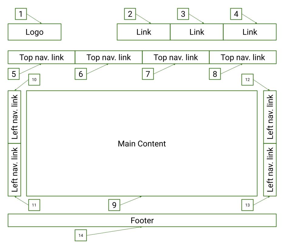
Example 1: Tab Order Structure
the image below shows the correct reading order on a page that has multiple navigation links on the side panels.
Example 2: Tab Order Video
The video demonstrates what keyboard focus and a correct tab order look like.
Testing the tab order requires a keyboard accessibility evaluation. The basic functions to use for keyboard accessibility evaluation are:
- Tab key to navigate through links and form controls
- Enter (and /or Spacebar) to select an element
- Arrow keys are sometimes used for other navigation
In addition to these functions, there are several other standard keyboard shortcuts to be familiar with in order to conduct a keyboard test. Review WebAIM's shortcuts table to understand how to navigate through a webpage with the keyboard.
General Test
- Start from the browser address bar (This forces focus to start at the top of the page)
- Take your hand off your mouse and use only your keyboard
- Using the Tab button, navigate until you reach the bottom of the page (Shift + Tab can be used to navigate back one element)
- All interactive elements are accessible with the Tab key
- The tab order coordinates with the structure of the page (left to right, top to bottom - header first, then main navigation, then page navigation (if present), and finally the footer)
- An easy to follow keyboard focus is present that clearly indicates where you have tabbed to
WebAIM Standard Keyboard Shortcuts Table
| Interaction | Keystrokes | Notes for Accessibility |
|---|---|---|
| Navigate to interactive elements | Tab - Navigate forward Shift + Tab - Navigate backward |
Visual focus indicators must be present Navigation order should be logical and intuitive |
| Link | Enter | Must activate the element |
| Button | Enter or Spacebar | If an element has the ARIA role="button", ensure the element can be activated with both key commands |
| Checkbox |
Tab - move to the next element Spacebar - check/unbox a checkbox |
Checkboxes should be used when one or more option can be selected |
| Radio buttons |
↑/↓ or ←/→ - select an option Tab - move to the next element |
Radio buttons should only be used when only one option from a group can be selected |
| Select (dropdown) menu |
↑/↓ - navigate between menu options Spacebar - expand Esc - collapse |