Featurette Module Tutorial
Instructions
The module is available for use across the following template pages:
Featurette Options
In Cascade, you can choose between two featurette styles: a circular view for a compact, visually distinct display or a full-width view for a more immersive and expansive presentation. Expand the accordions below to explore each option in detail.
Page View
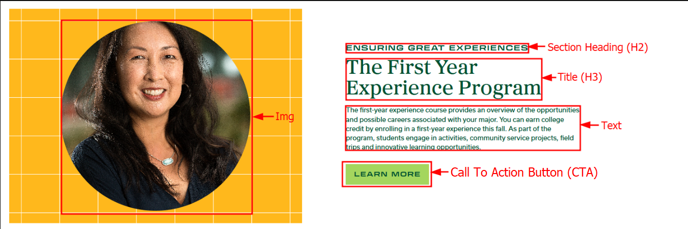
For this section you will need:
- Image
- 2 Headings (H2 and H3)
- Description
- CTA Button w/ Link (Optional)
- Note: “Click Here” and similar phrases are inaccessible for screen readers. Instead, use accessible calls to action such as Register Now, Learn More, Contact Us, Schedule an Appointment, Apply, etc.
Cascade View
Instructions:
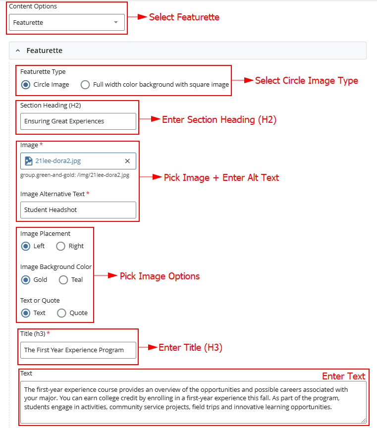
- Content Options: Select "Featurette" module in content options
- Featurette Type: Select Circle Image Type
- Heading: Add Section Heading
- Image: Add Image and enter Image Alt Text
- Pick Image Options
- Title: Enter Title
- Text: Enter Text
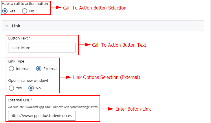
- Have a call to action button?: select Yes or No.
- Button Text: Call to Action Button Text
- Link Type: Select Internal Page or External URL
- Page / URL: Select the internal Cascade page or paste a URL
 OR
OR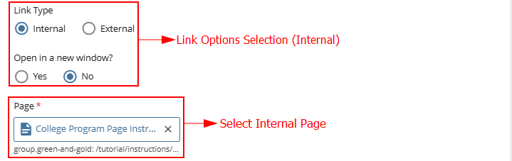
Page View
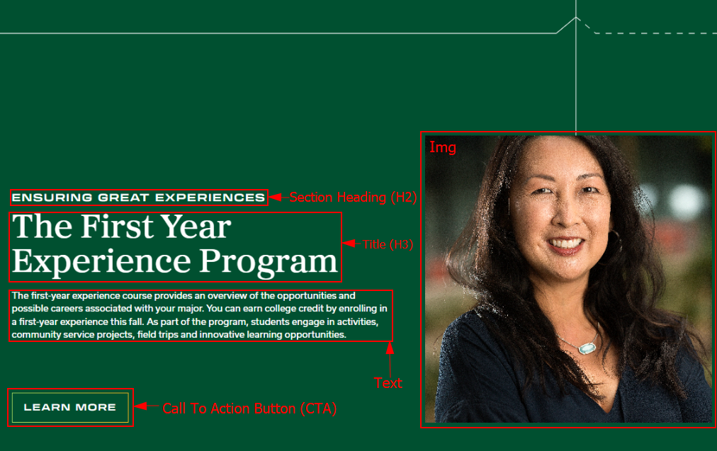
For this section you will need:
- Image
- 2 Headings (H2 and H3)
- Description
- CTA Button w/ Link (Optional)
- Note: “Click Here” and similar phrases are inaccessible for screen readers. Instead, use accessible calls to action such as Register Now, Learn More, Contact Us, Schedule an Appointment, Apply, etc.
Cascade View
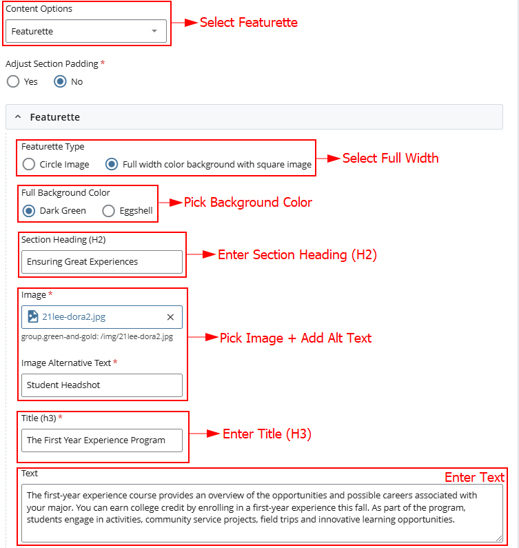
Instructions:
- Content Options: Select "Featurette" module in content options
- Featurette Type: Select Full Width Type
- Full Background Color: Pick Dark Green or Eggshell
- Heading: Add Section Heading
- Image: Add Image and enter Image Alt Text
- Title: Enter Title
- Text: Enter Text
- Have a call to action button?: select Yes or No.
- Button Text: Call to Action Button Text
- Link Type: Select Internal Page or External URL
- Page / URL: Select the internal Cascade page or paste a URL
OR