Carousel Cards Module Tutorial
Instructions
The module is available for use across the following template pages:
- College Department Page
- College Landing Page
- Division Department Page
- Division Landing Page
- Gateway Page
- Program Page
- Content Subpage
If you need assistance uploading images or videos, please refer to the Adding Content Instructions page. Visit the page and follow the provided instructions to upload your files correctly.
Adding Carousel Cards
In Cascade, you can choose between three carousel card styles: text only, college department (image and text with call-to-action), and image and text. Expand the accordions below to explore each option in detail.
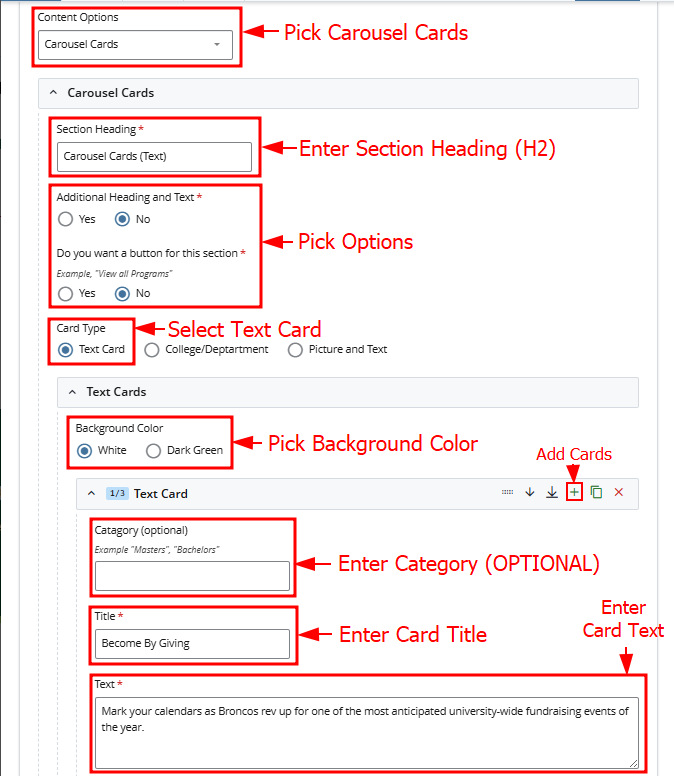
Page View
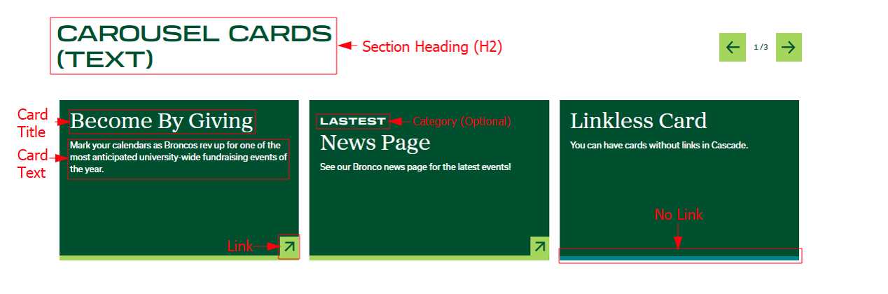
For this section you will need:
- Heading (H2)
- Card Titles + Text
- Card Links (Optional)
Cascade View
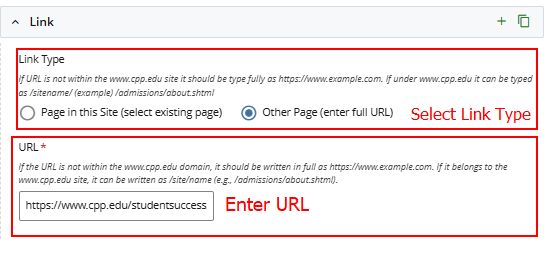
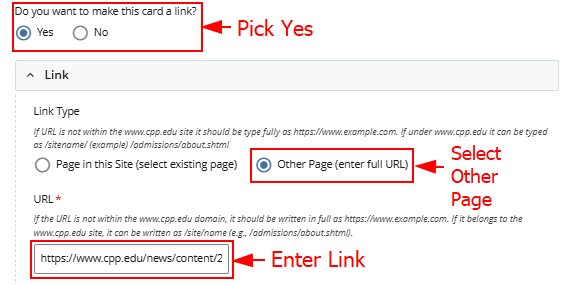
Link Option 1
Link Option 2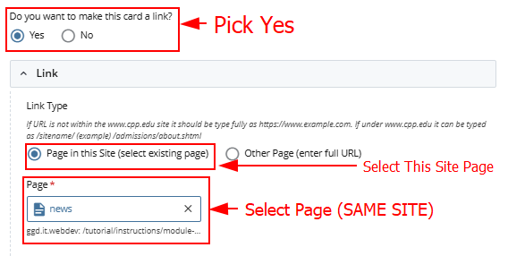
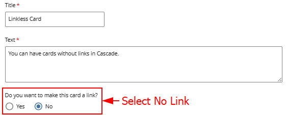
No Link
Page View
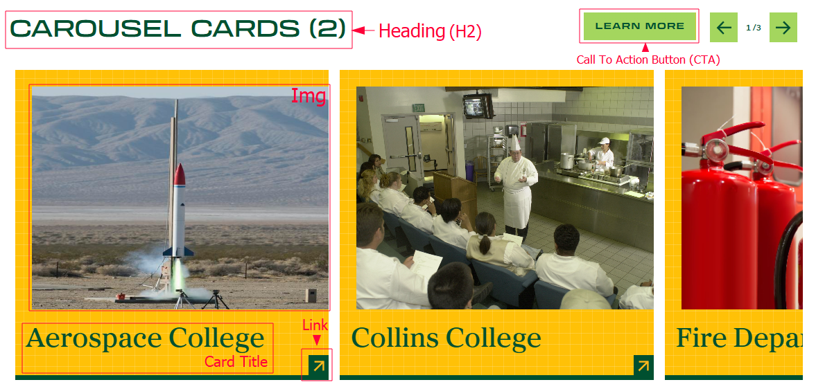
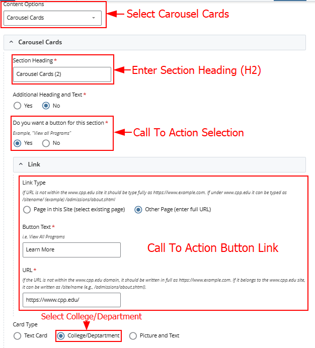
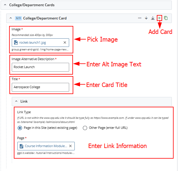
For this section you will need:
- Heading (H2)
- Card Titles + Images
- Card Links (Optional)
- CTA Button + Link (Optional)
Cascade View
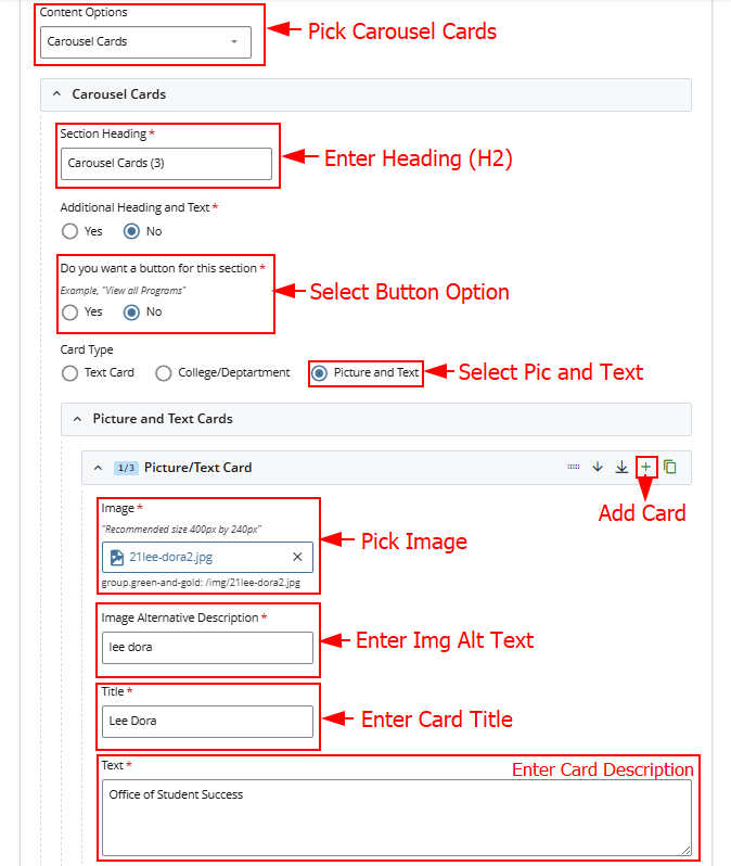
Page View
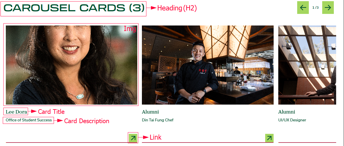
For this section you will need:
- Heading (H2)
- Card Titles + Images + Descriptions
- Card Links (Optional)
- CTA Button + Link (Optional)
Cascade View